Make a slope chart.
Usage
ggslope(
  data,
  times,
  outcome,
  group,
  color = NULL,
  alpha = NULL,
  linetype = NULL,
  size = NULL
)
Arguments
- data
Data
- times
Times
- outcome
Outcome
- group
Group
- color
Color
- alpha
Alpha
- linetype
Linetype
- size
Size
Examples
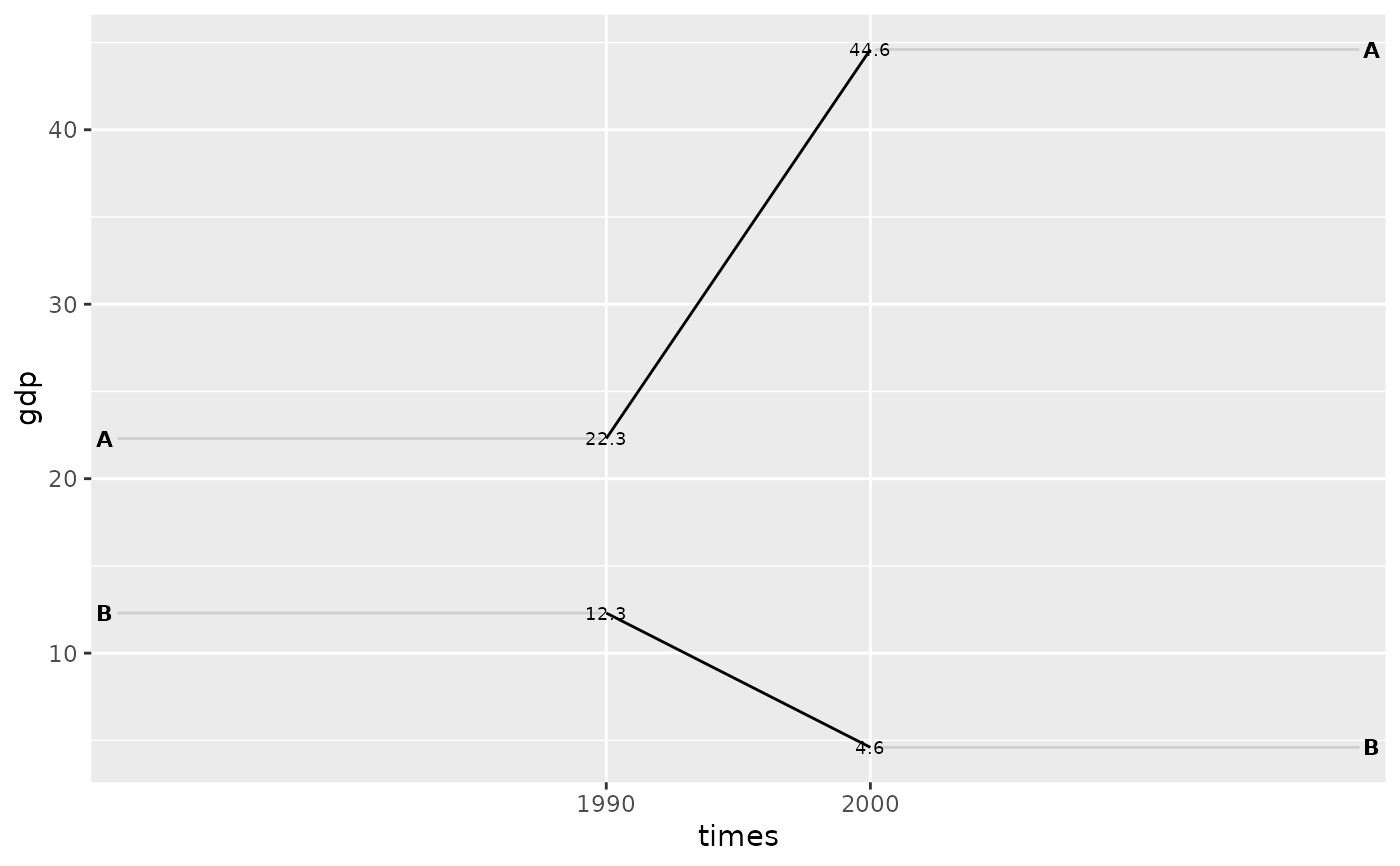
df <- tidyr::tribble(
~times, ~country,  ~gdp, ~inc,
"1990",   "A",  22.3, TRUE,
"2000",   "A",  44.6, TRUE,
"1990",   "B",  12.3, FALSE,
"2000",   "B",  4.6, FALSE
)
ggslope(df,
        times = times,
        outcome = gdp,
        group = country)