When it comes to visualizations, R user know base R plots and very like the ggplot2 package. This chapter shows how to create visualizations with Python packages like plotnine that mimic the logic of the ggplot2 package. The latter implements the grammar of graphics, which is a powerful way to create visualizations. The grammar of graphics is a way to describe the components of a plot, such as the data, the aesthetics, and the geometries, in a structured way. This makes it possible to create complex visualizations by combining components.
In this chapter I show how to create common visualizations with Python. First, I show how to create quick visualizations with the matplotlib package, which is the most popular package for creating visualizations in Python. I also show how to create visualizations with the seaborn package, which is another popular package for creating visualizations. The seaborn package is built on top of matplotlib and provides a high-level interface for creating attractive visualizations. Finally, I show how to create visualizations with the plotnine package, which is a Python implementation of the ggplot2 package. If you are familiar with ggplot2, you will feel right at home with plotnine. The plotnine package implements the grammar of graphics in Python.
Let’s start by loading some data. I will use the penguins dataset from the seaborn package and I import matplotlib. Furthermore, the matplotlib.pyplot module is imported as plt.
#importing seaborn the penguins datasetimport seaborn as snsimport matplotlibimport matplotlib.pyplot as pltpenguins = sns.load_dataset("penguins")penguins = penguins.dropna()penguins.head()
#>   species     island  bill_length_mm  ...  flipper_length_mm  body_mass_g     sex
#> 0  Adelie  Torgersen            39.1  ...              181.0       3750.0    Male
#> 1  Adelie  Torgersen            39.5  ...              186.0       3800.0  Female
#> 2  Adelie  Torgersen            40.3  ...              195.0       3250.0  Female
#> 4  Adelie  Torgersen            36.7  ...              193.0       3450.0  Female
#> 5  Adelie  Torgersen            39.3  ...              190.0       3650.0    Male
#>
#> [5 rows x 7 columns]
The latter is a collection of command style functions that make matplotlib work like MATLAB. Each pyplot function makes some change to a figure. For example, a figure can contain multiple plots. The figure is the top-level container for all the plot elements. The axes is the actual plot. The axes contains the x-axis, the y-axis, the title, and the labels. The axes is the container for all the plot elements. The plot elements are the lines, the points, the bars, and the text that make up the plot.
3.1 Categorical data
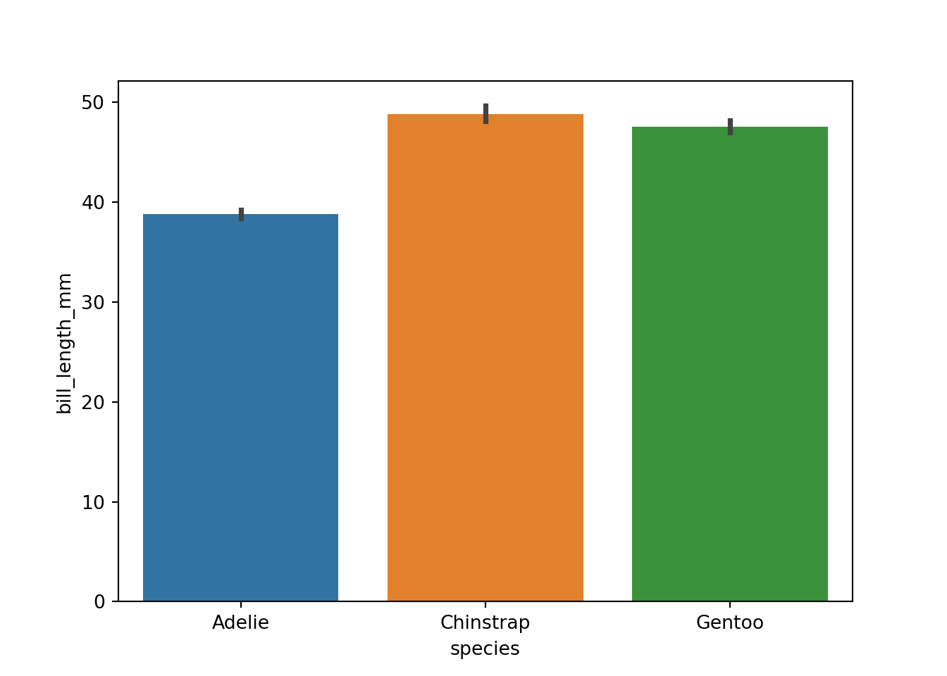
As outlined, the searborn package is built on top of matplotlib and provides a high-level interface for creating attractive visualizations. The seaborn package provides a number of functions for creating visualizations of categorical data. For example, you can create bar graphs, box plots, and violin plots with the seaborn package. To create a bar graph of the bill length of the penguins grouped by species, append the .barplot() function to the sns object and specify the data, the x variable, and the y variable.
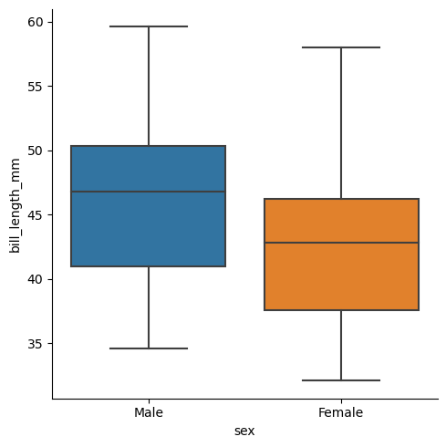
The catplot() function can be used to create a variety of visualizations of categorical data. For example, you can create a box plot of the bill length of the penguins grouped by species with the catplot() function. To create a box plot, set the kind parameter to “box”.
#Make a box plot with the catplot() functionsns.catplot(data=penguins, kind="box", x="sex", y="bill_length_mm")
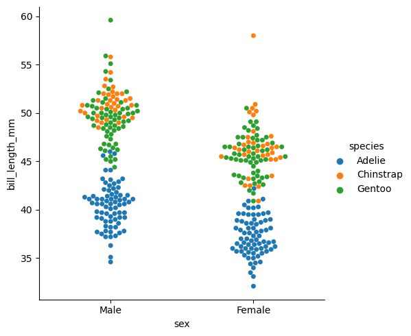
Box plots are a good way to visualize the distribution of a continuous variable within different categories, but they do not show the individual data points. A swarm plot is a good way to visualize the individual data points within different categories. A swarm plot is similar to a scatter plot, but it arranges the data points so that they do not overlap. To create a swarm plot of the bill length of the penguins grouped by species, set the kind parameter to “swarm”.
#Make a swarm plotsns.catplot(data=penguins, kind="swarm", x="sex", y="bill_length_mm", hue="species")
3.2 Relationsships
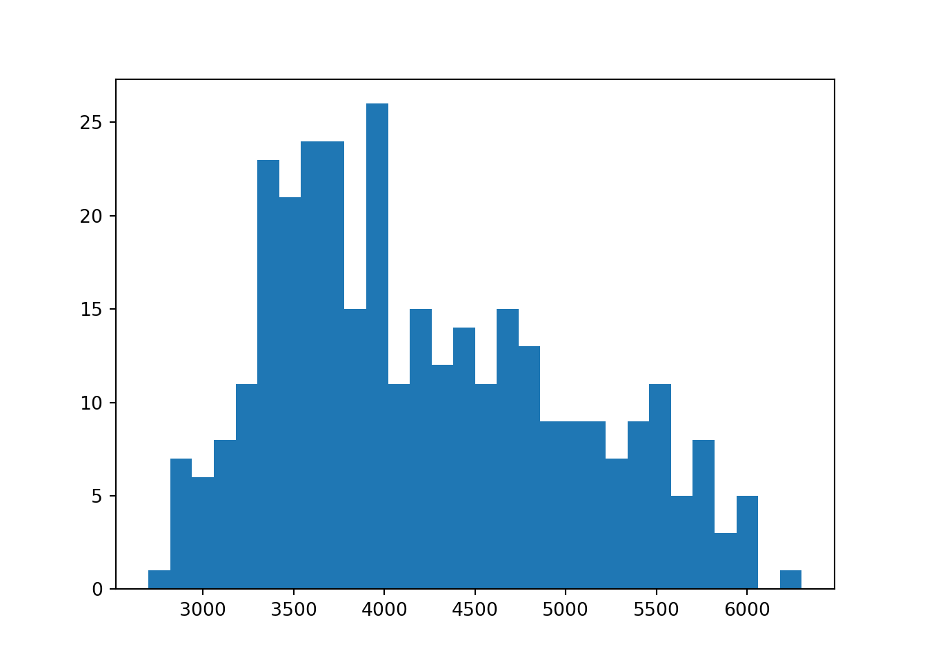
Next, we will focus on histograms and scatter plots. These are common visualizations for exploring numerical variables and the relationship between two continuous variables. To create a histogram of the body mass of the penguins, use the hist() function from the matplotlib package. The hist() function takes the data as input and creates a histogram of the data. The number of bins can be specified with the bins parameter.
#Hist with matplotlibplt.hist(penguins.body_mass_g, bins=30)
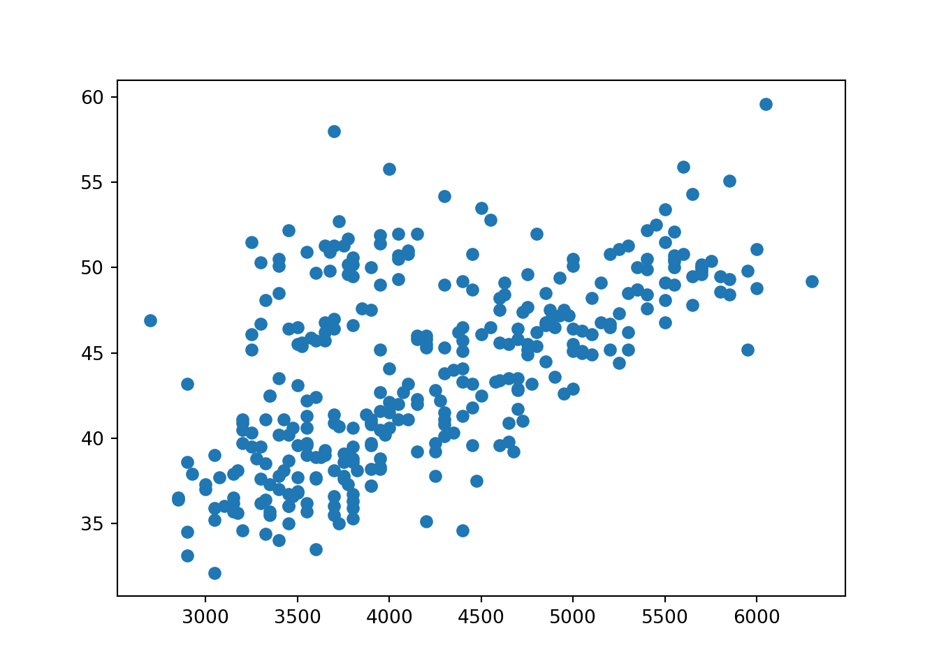
And in case of a scatter plot, you can use the scatter() function from the matplotlib package. The scatter() function takes the x-axis variable and the y-axis variable as input and creates a scatter plot of the data. For example, how is the body mass of the penguins related to the bill length?
#Scatterplot with matplotlibplt.scatter(penguins.body_mass_g, penguins.bill_length_mm)
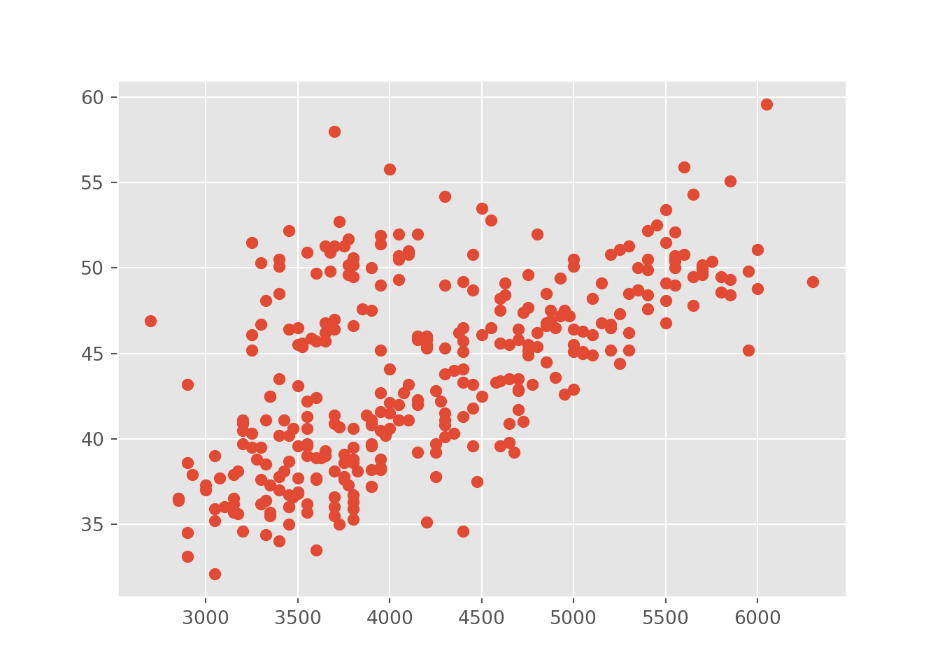
Coming from the R universe, I don’t like the default style of matplotlib. I prefer the ggplot style. To use the ggplot style, you can use the matplotlib.style.use() function and set the style to “ggplot”.
#Adjust the stylematplotlib.style.use('ggplot')plt.scatter(penguins.body_mass_g, penguins.bill_length_mm)
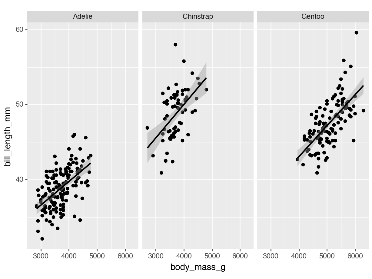
Nobody said that the ggplot style is the best. It’s just a matter of taste and I also do not like some details of default ggplot2 style. The good news is, we can adjust all details if we switch back to the ggplot2 approach and the plotnine package. Having an R background, the code to create the same scatter plot with the plotnine package looks very familiar. The ggplot() function creates a plot object; the aes() function is used to specify the x-axis variable and the y-axis variable. The geom_point() function adds points to the plot or more precisely, it adds a geom to the plot. The stat_smooth() function is used to add a linear regression line to the plot. The facet_wrap() function is used to create separate plots for each species.
#Scatterplot with plotninefrom plotnine import*#Create a scatter plot with plotninep = ggplot(penguins, aes('body_mass_g', 'bill_length_mm')) + geom_point()#Add a linear regression line and facet the plot by speciesp = p + stat_smooth(method='lm') + facet_wrap('~species')print(p)
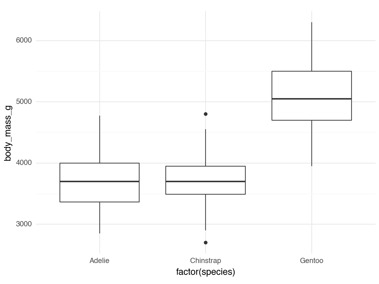
Look at the next code: We can create a box plot of the body mass of the penguins grouped by species with the geom_boxplot() function. The factor() function is used to convert the species variable to a factor variable. In addition, themes in plotnine can be adjusted like in ggplot2. The theme_dark() function creates a dark theme for the plot or the theme_minimal() function creates a minimal theme for the plot.
# A boxplot with factor variables and a themep = ggplot(penguins) + geom_boxplot(aes(x='factor(species)', y='body_mass_g')) + theme_minimal()print(p)
3.3 Fonts
To use a custom font in a plot, you need to download the font file and specify the path to the font file. You can download a font file from a website like Google Fonts. For example, to download the Roboto font from Google Fonts, use the following code.
import urllib.requesturl ='https://fonts.googleapis.com/css2?family=Roboto'# Replace with the Google Fonts URLfont_path ='Roboto-Regular.ttf'urllib.request.urlretrieve(url, font_path)
Next, you need to specify the path to the font file and set the font family in the plot. The following code shows how to use the Roboto font in a plot.
import matplotlib.font_manager as fmfont_path ='Roboto-Regular.ttf'# Path to your downloaded fontfont_prop = fm.FontProperties(fname=font_path)plt.rcParams['font.family'] = font_prop.get_name()plot = ( ggplot(data, aes('x', 'y')) + geom_point() + theme( plot_title=element_text(family=font_prop.get_name(), size=14, weight='bold') ))