Make a slope chart.
Usage
ggslope(
  data,
  times,
  outcome,
  group,
  color = NULL,
  alpha = NULL,
  linetype = NULL,
  size = NULL
)Examples
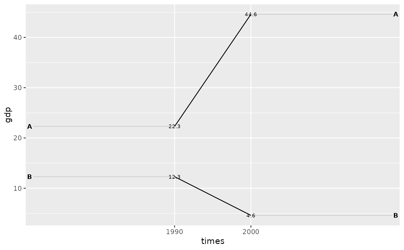
df <- tidyr::tribble(
  ~times, ~country, ~gdp, ~inc,
  "1990", "A", 22.3, TRUE,
  "2000", "A", 44.6, TRUE,
  "1990", "B", 12.3, FALSE,
  "2000", "B", 4.6, FALSE
)
ggslope(df,
        times = times,
        outcome = gdp,
        group = country)
#> Warning: Using `size` aesthetic for lines was deprecated in ggplot2 3.4.0.
#> ℹ Please use `linewidth` instead.
#> ℹ The deprecated feature was likely used in the edgar package.
#>   Please report the issue to the authors.